Tuesday, 10 December 2013

Wintec Student

           Right from the get go I could tell this was going to be a special year, our tutor was incredibly inspiring 
and the rest of the class was made up of really talented amazing people, it was great to journey together.
             One of the challenges, [actually requirements] we had was to draw a picture every day and see the improvement. 
The trick was to spend just a few short minutes on this task, not 20 minutes per drawing. Easier said than done.

Our first major project was to design and furnish Kieran and Kerriann's Kitchen / Dining and Lounge area. 
The mood board is followed by plans, elevations and perspectives.
Our major project for the 2nd semester was to renovate Brad and Jen's home. It was an old country villa that had 
miscellaneous add ons and this young family needed a house with flow to emerge out of the cacophony.
      My Inspiration for the Jones project came from their very own roots. Brad's kiwi upbringing meets Jens English heritage 
      and journeys in a new direction to embrace raising an active family in rural NZ. This is a unique marriage of solid 
      English country mixed with a generous dollop of kiwi art and style.


     Check out the artwork in the living area - this was one of my main inspirations for the area, a honey of a piece by Daniel 
     Kirsch. Through to the rear of the kitchen we find a  fully stocked scullery is hidden from view and a convenient 
     mudroom deals with the necessities of country living The back door leads out to the repositioned clothes line that has 
     found more sunlight. This home is woven together through classic style and design restrain. It is seasoned with 
     welcoming comfort and flair for all to enjoy.
This year has been very humbling, learning has been difficult and without the help of my classmates at times
 l would certainly not have passed. I have appreciated their patience and wisdom on many occasions. 
 Taking the time to help and  to love people is hard to do but l am grateful for the people who have invested in me. 
We can all be pretty awful at times, and loving and helping others is always a risk but a risk worth taking.  
I figure if l can bounce back from hard times, other people will be encouraged that it's possible.
[check out Joseph's life in Genesis 37 verse 1 - 50] 
Don't look in the rear vision mirror
Life is constantly changing. If we don't like that, we'll find things pretty hard. 
We have a choice to get over mistakes and to forgive.
 (God actively wants to help you with this, by the way. It's probs worth a chat with Him about it.) 
What now? Take some time today to thank God for the people he puts around you.

                                                                                                                                          Tony Ogle

Praise the LORD! Praise the LORD from the heavens! Praise him from the skies! Praise him, all his angels! Praise him, all the armies of heaven! Praise him, sun and moon! Praise him, all you twinkling stars! Praise him, skies above! Praise him, vapors high above the clouds! Let every created thing give praise to the LORD, for he issued his command, and they came into being. He established them forever and forever. His orders will never be revoked. Praise the LORD from the earth, you creatures of the ocean depths, fire and hail, snow and storm, wind and weather that obey him, mountains and all hills, fruit trees and all cedars, wild animals and all livestock, reptiles and birds, kings of the earth and all people, rulers and judges of the earth, young men and maidens, old men and children. Let them all praise the name of the LORD. For his name is very great; his glory towers over the earth and heaven! He has made his people strong, honoring his godly ones -- the people of Israel who are close to him. Praise the LORD!    Psalm 148 The Bible


Monday, 9 December 2013

Christmas is coming!!!

Yo ho ho…Christmas is coming well for me that is kind of a reality. I have just managed to make it through the first Christmas Party of the season. It went something like this… My sense of smell is sort of intrinsically connected to my heart. I tend to repetitively tell people they smell nice and my hands start waving round Italian style when l go into those boutiques that are filled with potpourri and lavender sachets.


So like 5 days before our [actually 1 of our] Christmas parties I decide I am going to have a lavender Potpouri Christmas theme. Ahhhh, so as it happens we have an amazing lady who has a lavender farm in Ngaruawahia, I go visit her and find I need to order the lavender off  her and can't pick it up till Thursday, the party is Saturday.  Lavender Farm


Meanwhile I also have the brainwave to paint our 2 very large tables…RED. This takes me and my obedient son Dylan a whole day. Sanding plus 4 coats of paint equals headache. The tree goes up Wednesday in-between painting and I decide to reuse some of our old Christmas baubles. I paint them lavender, spray glue them, then roll them in the dried lavender. This works pretty well. I finish them off by tying some pretty ribbon round the top of them and I alternate them with gold and fluted lavender baubles. The tree is a success. The tables which had looked decidedly scary when we painted them upside down actually come up a treat when we turned them upright and l was on my way to seeing my little Christmas vision come to fruition. 


Next problem, candle sticks, I had none. I headed down to the local Ngaruawahia Anglican second hand shop and found a little wrought iron number , which I promptly painted to match the red table, plus I grab a delightful porceline rose candlestick holder. 
I also spotted a great tall glass jar that looked perfect for displaying  my new stash of dried Lavender. So after parting with the large sum of $12 l take my finds home. Now it's time to maneuver my newly painted tables, tatty hand me down sofa and chairs, borrowed 2 x pews etc around repeatedly till l find a match that vaguely resembles the vision l have in my head. Oh how much fun and hard slog this all is.                                                        
 

Another thing that added to meld together a successful Christmas Party of people who often only meet at funerals and weddings, was to pick up a throng of interesting books suitable for various ages. This proved very useful and is a great conversation starter.


Above Gran Kimpton is checking out the Marvel Chronicle with Levi, our new 13 year old. The Hydranges are from my friend Lynne. They always add an olde world touch and fitted well with the lavender theme.

So 30 of us gathered  together, we sung a Christmas Carol - everyone had a "30 second moment of fame" to share what they had got up to over the year and then we meandered down to the bush and relaxed watching the kids play in the boat - 3 of the  very brave girls swam in the pond, it was fun. There were no presents, it was great to have no commercial pressures put on us. Just being together was a special gift, especially as we have recently seen a favorite Uncle go to be with the Lord. Jesus said: “For what will it profit them if they gain the whole world but forfeit their life?” All the material gifts in the world are not going to guarantee that we will have the happiest Christmas. As a matter of fact, the opposite may be true. we can become irritable and resentful because of all the added stress of fighting our way through mad crowds and traffic. The recipients of your gifts may not have shown you as much appreciation as you had expected. And, maybe an argument broke out after your spouse or children told you that your gift missed the boat altogether.” The words are a reminder of Christ our greatest gift of Christmas. We claim the promise of those words “born for us,” and “a son given to us.” The words come to us as gospel, GOOD NEWS!  Christmas Story


What a gift Jesus is for you, me and the whole world! Christ is unlike all other Christmas gifts or presents. Other Christmas gifts are limited, temporal, and often conditional. On the other hand, Christ our greatest gift offers us his unlimited grace and forgiveness; his gift of love lasts forever; and he offers himself to us without conditions. Such a great gift works in us and through us; touching us in the depths of our being. In response we too are then able to give and be bearers of gifts.
 We do not have to give or worry about giving to meet certain conditions; we do not give out of fear of punishment if we fail to or by being coerced into it; we do not give to earn acceptance or gain brownie points or to save ourselves. No, because Christ accepts and loves us unconditionally; we in response are set free to give, love, and serve others unconditionally. Christmas is our celebration of God’s ultimate gift of love. God saw our pain, our devastation, our hopelessness, our brokenness, and our fragile love and he loved us so much that 
“…he gave his one and only Son, that whoever believes in him shall not perish but have eternal life.” John 3 v 16 The Bible

Jesus is God’s ultimate gift. “Here, this baby is for you.”
“For a child has been born for us, a son given to us.” Jesus, the greatest gift of Christmas—for you, for me, for everyone. 
May you have a very Merry Christmas and no that know matter what you do God made and loves you very much.. 
Check this out - a cute song - Hush there's a baby


“What can you do to promote world peace? Go home and love your family.” ― Mother Teresa

 Love from The Kimptons
Pentatonix - Carol of the Bells


Saturday, 31 August 2013

By Golly!


No wonder my kids love going to Grannys. It's all about fun, photos and fabulous food. 
  • This shot illustrates a double split complementary colour scheme.
  • The use of harmony through progression.
  • And a lovely rhythm through pattern.

  Colour Wheel
With a starting off hue of green, this colour scheme sparks into life by incorporating blue, orange and a dash of red. Remember you can make your own recipe using a similar harmonious colour scheme. Decide on one hue to launch you, that will give you two choices of double split complementary colour schemes to decide on.

Harmony Through Progression
When you look at the way these rooms flow it is easy to spot some similarities.
  • Same treatment of skirting tiles and gold bar.
  • Same colour on walls and flooring.
  • Same style of furniture, photo frame shape and soft toys.

This gives the peaceful flow that comes from harmony through progression. The two spaces relate well to each other even though there are many differences. The chairs used in the blog picture are a similar style, the smaller chair is badly in need of repair but by covering with a throw it will continue to serve it's purpose well, till Granny can afford to reupholster it. 

"it's true - you can get the look too"

Victorian Chairs
chesterfield-suite            victorian chair            IDOChair            tartan               velvet
If you are trying to recreate a scene featuring period furniture it's always good to be a little flexible. There are some beaut buys in antique shops and tradme is fantastic. There are also some reproduction companys where they will upholster  your purchase in the fabric of your desire.

Rhythm of Pattern
personalised cushion                            scoti cushion                            crochet golliwog                             plaid teddy

A wonderful rhythm of pattern is established through the tartan theme that adorns the pillows, throw on the small chair and of course teddy himself. The varied rhythm, created through repetitive variety, gives depth to a design. 


Hint: When choosing between different white paints do not allow the samples to touch each other. You will not be able to clearly compare and analyse the colours as the colours affect each other if they are touching. Remember that different types of white have different psychological effects on you. A blue tint will make the space seem cooler. Creamier whites with a yellow base such as the one in the blog, will appear warmer and more inviting. At the moment the contemporary  trends in whites seems to be more to the brilliant cool blue whites, but for a more organic softer look a soft yellow white is best.


"I hate good taste. It's the worst thing that can happen to a creative person." 
- Helmut Newton

Thursday, 29 August 2013

Outside In

What a pretty picture. This setting has burst out of it's walls and challenges you to do the same.
Outdoor living isn't always possible due to apartments, smaller sections and busy lives.
But, you can still get the feel of 'Outside In' through the use of impressive wallcovering solutions. 
But first let's start with the design.

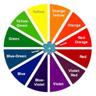
Analogous Colour Scheme

In my opinion this is one of the easiest colour schemes to master. It is great for creating warmth or a cooling effect and is often seen in nature. A good example is the colours of Autumn. 

The Colour Wheel

There are many combinations of Analogous Colour Schemes they usually create a subtle, harmonious feeling.

"it's true - you can get the look too"

Lights - Camera - Action
mural           pendants          pew
Step into another world a retreat, a sanctuary, a haven. 
Using a Photo Mural can be a really effective way of infusing character into your home.
The pendants shown can be easily made into a feature light by sourcing a reclaimed piece of timber and allowing your electrician to turn them into a bespock lighting fixture. The strong horizontal line that this creates works well against the vertically inspired background. The pew l have found has vertical lines unlike the blog pew. However the back of the pew is largely covered by the cushions in the design.

Choice Cushion Choices 
coastal design                         zazzle                               jilltuck
When you have a really high stud in your house horizontal lines can be a fantastic design tool for you to use. 
They shout 'this is the scene - that is the backdrop', they bring the focus down and widen the room so it changes the proportions. The horizontal line element has been repeated through the style of shelving. The shelf l found below could have extra shelves added and a paint job to create a similar look.


Shelving & Collectables
cat                          plane                       car                       teapot                      shelving

Another theme that is richly displayed in the blog is the use of harmony through variety. This is a fascinating way to show collections of similar items that are dear to you and they make great focal points and conversation starters. Note how even throughout the collectibles displayed, the choices are largely within the colour palette. 


Hint: If you look closely at the blog lighting, you will notice that we have used old paint cans as lamp shades. There are many different everyday objects that can be used in a similar way. Have a squize at the links below. It's great to let that kiwi ingenuity shine every now and then, take hold of your creative licence!

lightshadekits                   uniquelamp

The details are not the details, they make the design. - Charles Eames

Wednesday, 21 August 2013

Waiting Room Bliss

Time flys when you're having fun.
Wouldn't it be great if all waiting rooms were this inviting. Sit on a comfy chair, play with a rubiks cube or delve into the cabinet of magazines and toys. This room shows a great balance of fun and formality.

The Colour Wheel

Our blissful waiting room was designed for mums, dads, kids, professionals, for everyone who gets nervous and bored waiting. Colour can be a real tonic and by choosing a tetradic colour scheme, this business has stimulated and sidetracked its clients well.

Lets have a look at what a tetradic colour scheme is made up of. 


As you move the staples around the colour wheel, you can create a completely different tetradic look.  Often we emphasis one colour in this sort of colour scheme but in this case there is an effective balance.

Waiting Room Bliss Colour Palette


Stunning colours! I have chosen bright hues but don't be scared off. Explore the colour swatches at your favourite home renovation store and search through the shades and tints that will suit your scene.

Focus on design


"it's true - you can get the look too"


Design Choices
So let's not muck about, I know you're inspired, it's time to shop!
1. wallpaper/Resene This wallpaper is high on character and down to earth.
2. candles/BedBath&Beyond The candles are such an easy way to bring and take away colour, the ambience they give                                     through scent is priceless.
3. lightingdirect I chose these red/orange table lamps because they had similar chrome stands that tie in well with the                     retro clock. Embellishments could easily be added to bring in the harmony of shape.
4. clock/MightyApe Here's an impact piece, this clock  has a fabulous punchy presence, it is the same as the blog picture.
5. chair/JohncochraneThe chairs in the blog picture are from Target, swivelchair they are really fun. The 'get the look'                                    chairs are also great and John Cochrane will upholster them in your desired fabric.
6. sidecabinet/EarlySettler  We all love to catch up on what's hot through perusing the magazines in waiting rooms. 
                         I found it difficult to source a similar bi-fold distressed cabinet but this one would work well too.
7. rug/Forlongs Add a shag rug to bring in some tactile therapy.

Lastly, with the help of your trusted colour palette, buy make or order in some striking, washable cushions that will balance your tetradic colour scheme beautifully. Happy clients means happy you!

        Colours are the smiles of nature             


Hint: The cabinet that we have showed in the blog picture is upcycled. Search through local 2nd hand dealers or dump shops for some real gems. Distressing an item of furniture can be a quick effective way of 
doing it up and hiding some of its imperfections. 
It's also loads of fun and the outcome is completely unique and great for the planet. 
Check out Mitre 10's helpful info on distressing your furniture. distressingfurniture

"Creativity is allowing yourself to make mistakes. 
Design is knowing which ones to keep" - Scott Adams

Sunday, 18 August 2013

Girls Only !!!


Complementary Colour Scheme
Who needs pink when you can you can have aqua blue and rich salmon? Lilly Layne's room is radiantly coloured and playful, she is delighted to hang out with her dollys and friends in here.
This Complementary Colour scheme is sharp and clean. The harmony of colour is evident through a narrow effortless colour palette and a striking vertical line wallpaper provides a fabulous backdrop for little Lilly's bed.
The detailed rhythm of design is shown through the careful choice and placement of wall art, cushion and throw.


The Colour Wheel


 Opposites attract is the rule here. Choosing a complementary colour scheme can be very bold and brave, or by using shades and tints more muted but still super sassy. Both the blue/green and red/orange that l have chosen are tertiary colours. There is a marvelous array of Complementary Colour Choices.


Lilly Layne's Colour Palette


 I love how these hues springboard each other into life. 

 All things bright and beautiful
All creatures great and small
All things wise and wonderful
The Lord God made them all 
                                         Cecil Frances Alexander


Choices and Challenges

"Happiness is not the absence of problems; it's the ability to deal with them." Steve Maraboli


Ok Bloggers today l have given you a challenge; two choices.
On the right l have stuck with the original blog picture colour scheme.
But on the left l have mixed things up by picking the opposing colours.
Tweak things, change them up, use your palette like a jigsaw puzzle, adding and taking away till you are satisfied.
This exercise will help, when you are really sure of your colours, but not sure of how to spend your colour clout. 


"it's true - you can get the look too"

          
The 'wow factor' - that's what this
wallpaper will give you. I have chosen to go with the alternative colour scheme from the left, I reckon Lilly Layne would love this option too. This paper really retains the wonderful vertical line design element from Lilly's room. The red/orange colour contrasting with the white gives a really similar feel to the  blog wallpaper.wallpaper

You'll note that this chair is armless, just like the blog bedside chair. I picture this as a super place for parents to read bedtime stories and encourage their children through life's hiccups and triumphs. bedside chair 

What a great throw, the colour is warm and works wonderfully in this complementary colour scheme. throw  


Cushions are a license to play, but be careful not to overdose on them and lose your rhythm of design. The flower cushion in the 'Girls Only' picture shows both a hue and a softer tint; you can get that cushion from bosinteriors . The blue/green cushion on the left here is from felt  and it would work well in the original scene as it matches the wallpaper hue perfectly. The red/orange cushion from freedomfurniture  adds texture to the setting through its knitted covering. The far right cushion tones in better with the throw pictured and l really like that it has girly flowers on it. Buy this from thewarehouse. 


Never forget who your client is!


When researching colours and products on the internet, be sure not to rule things out if they don't match your selected palette perfectly, until you have personally viewed them. Colours vary alot depending on what program and computer you are using. Here are the links that l sourced from the second option.


 Now...which option do you prefer?

Wall Art

Wall art is prevalent at the moment, you can purchase all sorts of fabulous creations and sculptures to bring life and interest into your walls. Putting your child's name on the wall is a great way to affirm them and bring real individuality into 'their space.' There are many businesses that make personalized wall art; check out these guys wallart or MDF wallart.


Be inspired, use your favourite colour as a springboard!