Monochromatic / Asymmetrical Design
Our fearless fisherman is someone used to taking risks and it's thumbs up to the bold colours he has in his Fisherman's Hut. Frank needs a place to file his rod and drop his hat after a long day fishing and this is a great place to come home to. Because of the nature of the casual asymmetrical layout Frank doesn't feel like
he's going to put anything in the wrong place, especially his favourite drop of ale.
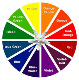
colour wheel link
A monochromatic colour scheme focuses on using a single colour. We then take that colour and explore the detailed tints and shades from one particular hue, then in turn pairing it up with black, white and other neutrals to create a really pleasing outcome.
The Fisherman's Hut Colour Palette
What l love about these blue hues, is the freshness they bring and that you can pay more attention
to the feel of the setting than being distracted by pops of colour jumping out for attention.
This look is easy on the eye and wouldn't be too hard for your average kiwi bloke to live with.
"it's true - you can get the look too"
Head down to your local home decor store and have a play.
To really achieve a good monochromatic solution you need to show a little do - it - yourself 'self control.'
Pick a colour from the colour wheel then find a suitable colour swatch. Now stick to it!
That way you will be working within the colour hues and shades that will really define the rhythm
of this colour scheme. Remember the monochromatic colour scheme is very simplistic in principle.
Show restraint and allow the hues and shades to do the talking.
Check it out!
The paint used in the Fisherman's hut looks great but how about trying a photomural for a point of difference. You can buy amazing wallpaper scenes like this at most home decorating shops. This would be a fantastic feature wall and the blues in the water would make a great backdrop for your collection of everyday fisherman 'knick-knacks'.
Wallpaper can really change the feel of a scene. This dark navy shade of blue would be a different take on the look.
The different texture of the iron would bring a whole new dimension to your decorating experience. Make sure you repaint it if it is not in your palette. Consider which way you would run the iron as horizontal lines give the illusion of bringing the ceiling lower and widening the room.
Ok, so you've chosen great wallcoverings, now you need to dress the walls. This is a lovely picture but the hues in the water contain far too much green. Don't let your guard down, keep searching for the right picture.
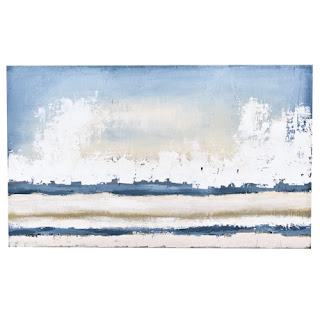
This print is far more in keeping with our true blue palette.
HINT: Try framing your own pictures, especially if you are finding it difficult to source a picture in just the right colours. If you're a wizz on the computer you can photoshop any unwanted colour out, or if not, try printing off a picture in black and white then grab out the paint box.
Now you're totally in control and you can highlight colours just where you want to!
Great tall ornamental bottle with lovely colouring but may not be functional enough for this man pad.
Perfect lamp for our snapshot. This is the sort of lamp shade you can embellish with strips of blue material or braiding to bring it right into your desired colour scheme.
Wow this lamp really feeds into the nautical theme but rope lamps aren't to everyone's taste.
Cool clock - spot on shade of blue, this would really add to your monochromatic theme.
Here's a catchy mug in a lovely true blue.
This looks like a very similar style of pot as in our original picture - you really can get the look.
This curtain material is fabulous, it is really pushing towards the light grey end of the pallet. It would
subtly add a defining edge to the windows, instead of the plain white curtains pictured.
What a fabulous industrial table, don't you love it! Extremely expensive and from California unfortunately.
I feel the ladder tressel used in the original picture is much easier to source and a lot softer on the wallet.
HINT: To try this out at home focus on a small area like an entrance way or nook. This is a good way to build your confidence. Make it fun by not analyzing the project too much - focus on getting your colours right, then evaluate your effort. An asymmetrical design is quite easy as the constraints that come with symmetry aren't there.
You will quickly get a feel for what's missing - height, more colour, fabric etc.
A display like this if done economically can be changed seasonally or for parties and celebrations.
There's no time like the present...


