Wednesday 21 August 2013

Waiting Room Bliss

Time flys when you're having fun.
Wouldn't it be great if all waiting rooms were this inviting. Sit on a comfy chair, play with a rubiks cube or delve into the cabinet of magazines and toys. This room shows a great balance of fun and formality.
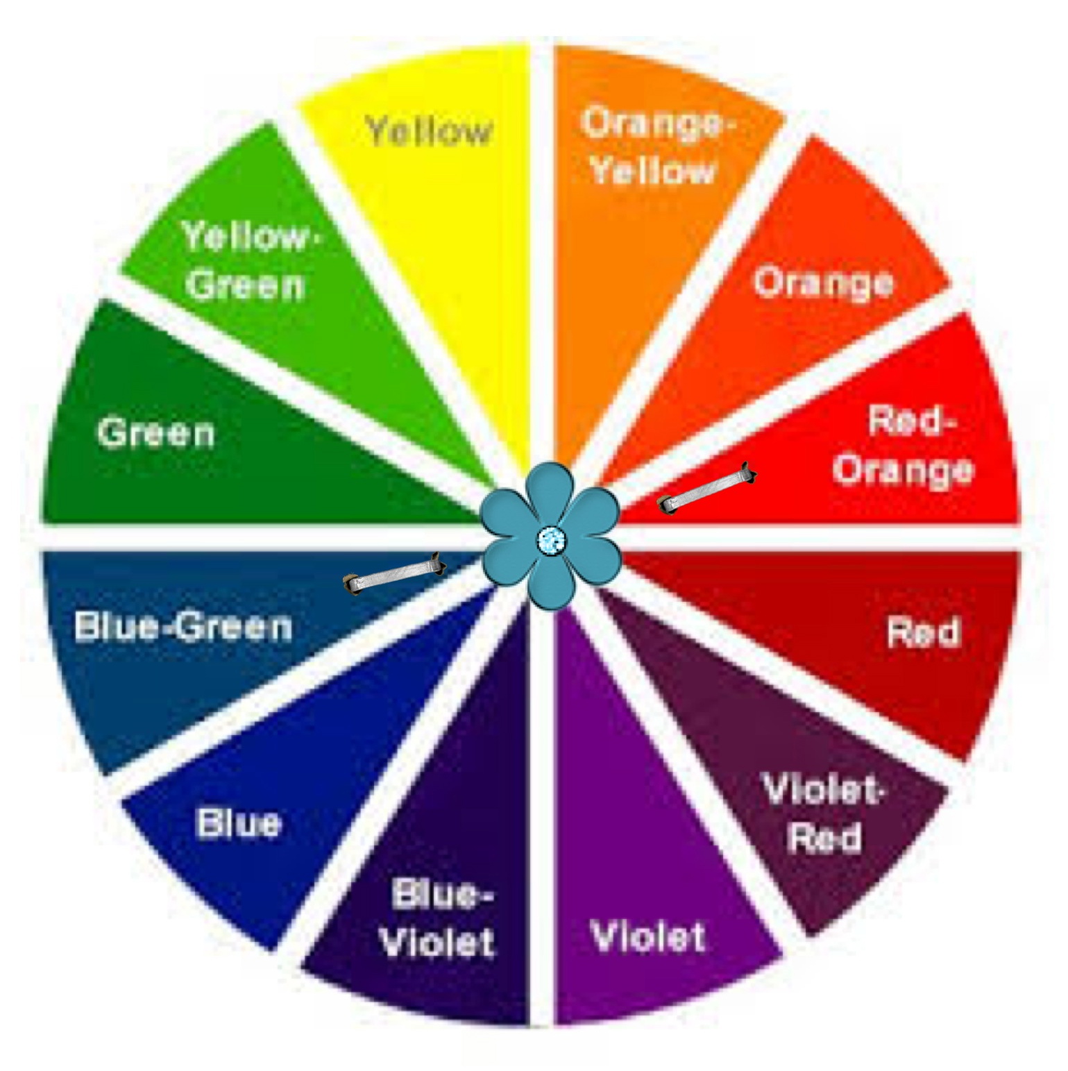
The Colour Wheel

Our blissful waiting room was designed for mums, dads, kids, professionals, for everyone who gets nervous and bored waiting. Colour can be a real tonic and by choosing a tetradic colour scheme, this business has stimulated and sidetracked its clients well.

Lets have a look at what a tetradic colour scheme is made up of. 


As you move the staples around the colour wheel, you can create a completely different tetradic look.  Often we emphasis one colour in this sort of colour scheme but in this case there is an effective balance.

Waiting Room Bliss Colour Palette


Stunning colours! I have chosen bright hues but don't be scared off. Explore the colour swatches at your favourite home renovation store and search through the shades and tints that will suit your scene.

Focus on design


"it's true - you can get the look too"


Design Choices
So let's not muck about, I know you're inspired, it's time to shop!
1. wallpaper/Resene This wallpaper is high on character and down to earth.
2. candles/BedBath&Beyond The candles are such an easy way to bring and take away colour, the ambience they give                                     through scent is priceless.
3. lightingdirect I chose these red/orange table lamps because they had similar chrome stands that tie in well with the                     retro clock. Embellishments could easily be added to bring in the harmony of shape.
4. clock/MightyApe Here's an impact piece, this clock  has a fabulous punchy presence, it is the same as the blog picture.
5. chair/JohncochraneThe chairs in the blog picture are from Target, swivelchair they are really fun. The 'get the look'                                    chairs are also great and John Cochrane will upholster them in your desired fabric.
6. sidecabinet/EarlySettler  We all love to catch up on what's hot through perusing the magazines in waiting rooms. 
                         I found it difficult to source a similar bi-fold distressed cabinet but this one would work well too.
7. rug/Forlongs Add a shag rug to bring in some tactile therapy.

Lastly, with the help of your trusted colour palette, buy make or order in some striking, washable cushions that will balance your tetradic colour scheme beautifully. Happy clients means happy you!

        Colours are the smiles of nature             


Hint: The cabinet that we have showed in the blog picture is upcycled. Search through local 2nd hand dealers or dump shops for some real gems. Distressing an item of furniture can be a quick effective way of 
doing it up and hiding some of its imperfections. 
It's also loads of fun and the outcome is completely unique and great for the planet. 
Check out Mitre 10's helpful info on distressing your furniture. distressingfurniture

"Creativity is allowing yourself to make mistakes. 
Design is knowing which ones to keep" - Scott Adams

Sunday 18 August 2013

Girls Only !!!


Complementary Colour Scheme
Who needs pink when you can you can have aqua blue and rich salmon? Lilly Layne's room is radiantly coloured and playful, she is delighted to hang out with her dollys and friends in here.
This Complementary Colour scheme is sharp and clean. The harmony of colour is evident through a narrow effortless colour palette and a striking vertical line wallpaper provides a fabulous backdrop for little Lilly's bed.
The detailed rhythm of design is shown through the careful choice and placement of wall art, cushion and throw.


The Colour Wheel


 Opposites attract is the rule here. Choosing a complementary colour scheme can be very bold and brave, or by using shades and tints more muted but still super sassy. Both the blue/green and red/orange that l have chosen are tertiary colours. There is a marvelous array of Complementary Colour Choices.


Lilly Layne's Colour Palette


 I love how these hues springboard each other into life. 

 All things bright and beautiful
All creatures great and small
All things wise and wonderful
The Lord God made them all 
                                         Cecil Frances Alexander


Choices and Challenges

"Happiness is not the absence of problems; it's the ability to deal with them." Steve Maraboli


Ok Bloggers today l have given you a challenge; two choices.
On the right l have stuck with the original blog picture colour scheme.
But on the left l have mixed things up by picking the opposing colours.
Tweak things, change them up, use your palette like a jigsaw puzzle, adding and taking away till you are satisfied.
This exercise will help, when you are really sure of your colours, but not sure of how to spend your colour clout. 


"it's true - you can get the look too"

          
The 'wow factor' - that's what this
wallpaper will give you. I have chosen to go with the alternative colour scheme from the left, I reckon Lilly Layne would love this option too. This paper really retains the wonderful vertical line design element from Lilly's room. The red/orange colour contrasting with the white gives a really similar feel to the  blog wallpaper.wallpaper

You'll note that this chair is armless, just like the blog bedside chair. I picture this as a super place for parents to read bedtime stories and encourage their children through life's hiccups and triumphs. bedside chair 

What a great throw, the colour is warm and works wonderfully in this complementary colour scheme. throw  


Cushions are a license to play, but be careful not to overdose on them and lose your rhythm of design. The flower cushion in the 'Girls Only' picture shows both a hue and a softer tint; you can get that cushion from bosinteriors . The blue/green cushion on the left here is from felt  and it would work well in the original scene as it matches the wallpaper hue perfectly. The red/orange cushion from freedomfurniture  adds texture to the setting through its knitted covering. The far right cushion tones in better with the throw pictured and l really like that it has girly flowers on it. Buy this from thewarehouse. 


Never forget who your client is!


When researching colours and products on the internet, be sure not to rule things out if they don't match your selected palette perfectly, until you have personally viewed them. Colours vary alot depending on what program and computer you are using. Here are the links that l sourced from the second option.


 Now...which option do you prefer?

Wall Art

Wall art is prevalent at the moment, you can purchase all sorts of fabulous creations and sculptures to bring life and interest into your walls. Putting your child's name on the wall is a great way to affirm them and bring real individuality into 'their space.' There are many businesses that make personalized wall art; check out these guys wallart or MDF wallart.


Be inspired, use your favourite colour as a springboard!