Saturday, 31 August 2013

By Golly!


No wonder my kids love going to Grannys. It's all about fun, photos and fabulous food. 
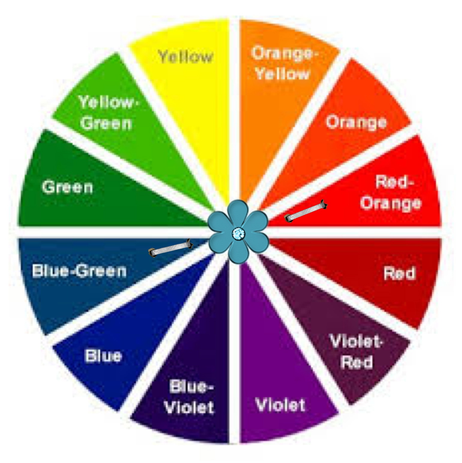
  • This shot illustrates a double split complementary colour scheme.
  • The use of harmony through progression.
  • And a lovely rhythm through pattern.

  Colour Wheel
With a starting off hue of green, this colour scheme sparks into life by incorporating blue, orange and a dash of red. Remember you can make your own recipe using a similar harmonious colour scheme. Decide on one hue to launch you, that will give you two choices of double split complementary colour schemes to decide on.

Harmony Through Progression
When you look at the way these rooms flow it is easy to spot some similarities.
  • Same treatment of skirting tiles and gold bar.
  • Same colour on walls and flooring.
  • Same style of furniture, photo frame shape and soft toys.

This gives the peaceful flow that comes from harmony through progression. The two spaces relate well to each other even though there are many differences. The chairs used in the blog picture are a similar style, the smaller chair is badly in need of repair but by covering with a throw it will continue to serve it's purpose well, till Granny can afford to reupholster it. 

"it's true - you can get the look too"

Victorian Chairs
chesterfield-suite            victorian chair            IDOChair            tartan               velvet
If you are trying to recreate a scene featuring period furniture it's always good to be a little flexible. There are some beaut buys in antique shops and tradme is fantastic. There are also some reproduction companys where they will upholster  your purchase in the fabric of your desire.

Rhythm of Pattern
personalised cushion                            scoti cushion                            crochet golliwog                             plaid teddy

A wonderful rhythm of pattern is established through the tartan theme that adorns the pillows, throw on the small chair and of course teddy himself. The varied rhythm, created through repetitive variety, gives depth to a design. 


Hint: When choosing between different white paints do not allow the samples to touch each other. You will not be able to clearly compare and analyse the colours as the colours affect each other if they are touching. Remember that different types of white have different psychological effects on you. A blue tint will make the space seem cooler. Creamier whites with a yellow base such as the one in the blog, will appear warmer and more inviting. At the moment the contemporary  trends in whites seems to be more to the brilliant cool blue whites, but for a more organic softer look a soft yellow white is best.


"I hate good taste. It's the worst thing that can happen to a creative person." 
- Helmut Newton

Thursday, 29 August 2013

Outside In

What a pretty picture. This setting has burst out of it's walls and challenges you to do the same.
Outdoor living isn't always possible due to apartments, smaller sections and busy lives.
But, you can still get the feel of 'Outside In' through the use of impressive wallcovering solutions. 
But first let's start with the design.

Analogous Colour Scheme

In my opinion this is one of the easiest colour schemes to master. It is great for creating warmth or a cooling effect and is often seen in nature. A good example is the colours of Autumn. 

The Colour Wheel

There are many combinations of Analogous Colour Schemes they usually create a subtle, harmonious feeling.

"it's true - you can get the look too"

Lights - Camera - Action
mural           pendants          pew
Step into another world a retreat, a sanctuary, a haven. 
Using a Photo Mural can be a really effective way of infusing character into your home.
The pendants shown can be easily made into a feature light by sourcing a reclaimed piece of timber and allowing your electrician to turn them into a bespock lighting fixture. The strong horizontal line that this creates works well against the vertically inspired background. The pew l have found has vertical lines unlike the blog pew. However the back of the pew is largely covered by the cushions in the design.

Choice Cushion Choices 
coastal design                         zazzle                               jilltuck
When you have a really high stud in your house horizontal lines can be a fantastic design tool for you to use. 
They shout 'this is the scene - that is the backdrop', they bring the focus down and widen the room so it changes the proportions. The horizontal line element has been repeated through the style of shelving. The shelf l found below could have extra shelves added and a paint job to create a similar look.


Shelving & Collectables
cat                          plane                       car                       teapot                      shelving

Another theme that is richly displayed in the blog is the use of harmony through variety. This is a fascinating way to show collections of similar items that are dear to you and they make great focal points and conversation starters. Note how even throughout the collectibles displayed, the choices are largely within the colour palette. 


Hint: If you look closely at the blog lighting, you will notice that we have used old paint cans as lamp shades. There are many different everyday objects that can be used in a similar way. Have a squize at the links below. It's great to let that kiwi ingenuity shine every now and then, take hold of your creative licence!

lightshadekits                   uniquelamp

The details are not the details, they make the design. - Charles Eames

Wednesday, 21 August 2013

Waiting Room Bliss

Time flys when you're having fun.
Wouldn't it be great if all waiting rooms were this inviting. Sit on a comfy chair, play with a rubiks cube or delve into the cabinet of magazines and toys. This room shows a great balance of fun and formality.

The Colour Wheel

Our blissful waiting room was designed for mums, dads, kids, professionals, for everyone who gets nervous and bored waiting. Colour can be a real tonic and by choosing a tetradic colour scheme, this business has stimulated and sidetracked its clients well.

Lets have a look at what a tetradic colour scheme is made up of. 


As you move the staples around the colour wheel, you can create a completely different tetradic look.  Often we emphasis one colour in this sort of colour scheme but in this case there is an effective balance.

Waiting Room Bliss Colour Palette


Stunning colours! I have chosen bright hues but don't be scared off. Explore the colour swatches at your favourite home renovation store and search through the shades and tints that will suit your scene.

Focus on design


"it's true - you can get the look too"


Design Choices
So let's not muck about, I know you're inspired, it's time to shop!
1. wallpaper/Resene This wallpaper is high on character and down to earth.
2. candles/BedBath&Beyond The candles are such an easy way to bring and take away colour, the ambience they give                                     through scent is priceless.
3. lightingdirect I chose these red/orange table lamps because they had similar chrome stands that tie in well with the                     retro clock. Embellishments could easily be added to bring in the harmony of shape.
4. clock/MightyApe Here's an impact piece, this clock  has a fabulous punchy presence, it is the same as the blog picture.
5. chair/JohncochraneThe chairs in the blog picture are from Target, swivelchair they are really fun. The 'get the look'                                    chairs are also great and John Cochrane will upholster them in your desired fabric.
6. sidecabinet/EarlySettler  We all love to catch up on what's hot through perusing the magazines in waiting rooms. 
                         I found it difficult to source a similar bi-fold distressed cabinet but this one would work well too.
7. rug/Forlongs Add a shag rug to bring in some tactile therapy.

Lastly, with the help of your trusted colour palette, buy make or order in some striking, washable cushions that will balance your tetradic colour scheme beautifully. Happy clients means happy you!

        Colours are the smiles of nature             


Hint: The cabinet that we have showed in the blog picture is upcycled. Search through local 2nd hand dealers or dump shops for some real gems. Distressing an item of furniture can be a quick effective way of 
doing it up and hiding some of its imperfections. 
It's also loads of fun and the outcome is completely unique and great for the planet. 
Check out Mitre 10's helpful info on distressing your furniture. distressingfurniture

"Creativity is allowing yourself to make mistakes. 
Design is knowing which ones to keep" - Scott Adams

Sunday, 18 August 2013

Girls Only !!!


Complementary Colour Scheme
Who needs pink when you can you can have aqua blue and rich salmon? Lilly Layne's room is radiantly coloured and playful, she is delighted to hang out with her dollys and friends in here.
This Complementary Colour scheme is sharp and clean. The harmony of colour is evident through a narrow effortless colour palette and a striking vertical line wallpaper provides a fabulous backdrop for little Lilly's bed.
The detailed rhythm of design is shown through the careful choice and placement of wall art, cushion and throw.


The Colour Wheel


 Opposites attract is the rule here. Choosing a complementary colour scheme can be very bold and brave, or by using shades and tints more muted but still super sassy. Both the blue/green and red/orange that l have chosen are tertiary colours. There is a marvelous array of Complementary Colour Choices.


Lilly Layne's Colour Palette


 I love how these hues springboard each other into life. 

 All things bright and beautiful
All creatures great and small
All things wise and wonderful
The Lord God made them all 
                                         Cecil Frances Alexander


Choices and Challenges

"Happiness is not the absence of problems; it's the ability to deal with them." Steve Maraboli


Ok Bloggers today l have given you a challenge; two choices.
On the right l have stuck with the original blog picture colour scheme.
But on the left l have mixed things up by picking the opposing colours.
Tweak things, change them up, use your palette like a jigsaw puzzle, adding and taking away till you are satisfied.
This exercise will help, when you are really sure of your colours, but not sure of how to spend your colour clout. 


"it's true - you can get the look too"

          
The 'wow factor' - that's what this
wallpaper will give you. I have chosen to go with the alternative colour scheme from the left, I reckon Lilly Layne would love this option too. This paper really retains the wonderful vertical line design element from Lilly's room. The red/orange colour contrasting with the white gives a really similar feel to the  blog wallpaper.wallpaper

You'll note that this chair is armless, just like the blog bedside chair. I picture this as a super place for parents to read bedtime stories and encourage their children through life's hiccups and triumphs. bedside chair 

What a great throw, the colour is warm and works wonderfully in this complementary colour scheme. throw  


Cushions are a license to play, but be careful not to overdose on them and lose your rhythm of design. The flower cushion in the 'Girls Only' picture shows both a hue and a softer tint; you can get that cushion from bosinteriors . The blue/green cushion on the left here is from felt  and it would work well in the original scene as it matches the wallpaper hue perfectly. The red/orange cushion from freedomfurniture  adds texture to the setting through its knitted covering. The far right cushion tones in better with the throw pictured and l really like that it has girly flowers on it. Buy this from thewarehouse. 


Never forget who your client is!


When researching colours and products on the internet, be sure not to rule things out if they don't match your selected palette perfectly, until you have personally viewed them. Colours vary alot depending on what program and computer you are using. Here are the links that l sourced from the second option.


 Now...which option do you prefer?

Wall Art

Wall art is prevalent at the moment, you can purchase all sorts of fabulous creations and sculptures to bring life and interest into your walls. Putting your child's name on the wall is a great way to affirm them and bring real individuality into 'their space.' There are many businesses that make personalized wall art; check out these guys wallart or MDF wallart.


Be inspired, use your favourite colour as a springboard! 

Monday, 12 August 2013

Ohhh La La


 Triadic Colour Scheme

The scene is set for action!  A striking primary triadic colour scheme. 
It is warm and pleasing to the eye to see the lavish use of red grounding the room. The intense adrenaline - rushing colour hues, give a charged rhythm to the setting. Radial balance clearly emits out from the red hanging pendant, giving a sense of intimacy. 

The Colour Wheel


Ohhh La La Colour Palette


  Red Yellow and Blue are my chosen triadic colour scheme. They create a strong authoritative colour statement. 
In this case tints and shades have been left in the dust and only the strong hues have been left to do the talking.
 l encourage you to purchase a colour wheel yourself from your local paint shop and boldly experiment with all the different triadic combinations.


"it's true - you can get the look too" 


Pendant Ambience


I really love this brightly coloured dramatic pendant and although it is quite a different shape from the original, 
l think it's worth considering.

 Table for Two


          Even with no table cloth this table is a winner. 
Another terrific thing about this table is that it comes in three different sizes.


Rippa Red Chair


Have some fun choosing chairs, it's not that hard to find quite a variety of red chairs. This is one that really took my eye, it is a classy take on a simple red chair that you can find through ecc furniture ecc furniture link or, for the perfect blog match, go to Big Save Furniture  for the chairs pictured.


Romance in Red


 l think the roses would be a great talking point over dinner. This rug is a lot more vibrant than the blog rug which is more of a geometrical print. The colour is fantastic however and is really shouting out, l'm special.
Find this rose rug here.Harvey Norman Rug Link

 "To paraphrase a classic riddle, which weighs more: a pound of yellow feathers or a pound of red lead?"
The Swiss painter Paul Klee observed that colour can be, "neither weighed nor measured." 


Yellow Vase Project

 It's as simple as grabbing a ball of wool from the $2 shop. There probably isn't an easier do - it - yourself project than yarn wrapping. Find an object that you want to cover, it can be anything from a bicycle to cut out letters spelling your name. You can use modge podge or white glue, spread evenly over the surface, then wrap to your heart's content. A super winter's night project that can upcycle an old item and really enhance your designer look.


The yellow yarn vase infuses tactile texture into this romantic scene.


The secret of creating a knock out design is...
 getting started! 


Wednesday, 31 July 2013

BOY oh BOY !!!


 Double Complementary Colour Scheme

Here's a growing boy's room. 'I'm not a kid anymore,' Reece reminds his mum.
 And that's what we see here, Reece's toys are packed in his chest for a rainy day and a touch lamp and retro chair become grown up furniture choices with a really fun edge. 
 An informal balance is created here through asymmetrical design. A stimulating rhythm is translated through the use of constant color repetition.
The Colour Wheel


This double complementary colour scheme provides a wonderful contrast. 
It is built around the green and green/yellow hues that are next to each other
 on the above colour wheel. We then move to the other side of the colour wheel 
and add the two opposing hues, that's a recipe for drama. 
 A bright stimulating environment has been given a sophisticated edge 
through well thought out colour choices. 
You'll be amazed at the funky outcomes that a 
Double Complementary colour scheme can offer you.
Boy oh Boy!!! Colour Palette


 Intense energetic red meets calm healthy green 
- this is not for the faint hearted decorator.
When adhering to a specific colour scheme you have loads of freedom to use 
shades and tints that extend from your selected hues. 
But, beware of stepping into the neighbouring hue! 
HINT: Print off several copies of your palette so you have one in your bag, one by the computer, one in the TV room then, when you see ideas you can quickly process whether they are an option for your room or not. 


"it's true - you can get the look too" 

 Do it yourself handyman projects, recycled shopping and brand new buys, 
this bedroom is a combination of them all.

Pin Board Project 


There are so many fantastic fabrics instore and online. 
If you're stumped check out online patchwork fabric sites.
I love the combination of these two fabrics. They make a good alternative to 
the blog picture, as a wonderful feature element in a boys room.


 Sew contrasting fabric together and glue and staple to the rear of pinex softboard to create an instant feature wall. Easy individuality and cost efficient!

Perfect Chair


 I chose this chair because it is a modern retro look. It is also decidedly reasonably priced and a beaut colour to match in with the original pin board material. 
It is adjustable and simple, we don't want a prima donna chair.

Just like the real one!


 Find this fabulous light here.

add character cushions


Take the opportunity to have fun with your cushion choice, there is a plethora of variety these days to choose from, or even better, take the opportunity to make your own.


                                                                       Trade Aid link

The trunk


I found this lovely old wooden trunk on Trademe. With a lick of paint it will be perfect for Reece's not so often used treasures.  
Painting it up in 'Resene X Factor' will bring this second hand find 
right into our 'double complimentary' color scheme.


 "Why do two colours, put one next to the other, sing? 
Can one really explain this?
 No. Just as one can never learn to paint." 
Pablo Picasso 


 Let's face it, shopping for duvets can be a nightmare. There are so many cool designs out there but finding something in our particular colour palette can be difficult.
 We often end up settling for something that's actually, not quite right. 
So grab your selected colour palette and choose a bed sheet.
 Next head to your local fabric shop and pick out some material 
that will help to achieve your overall desired look.
 Cut to size and sew inside out. 
This is a super easy project that will really set your bed off brilliantly, 
well worth the effort.


Ok it's up an atom, your time now to experiment...